We’re proud to share the rebrand we built for one of the UK’s most recognised gaming and esports events, epic.LAN.
After 12 years without a refresh and the whirlwind that has been COVID, they wanted to come back to the events space later this year with a bang!
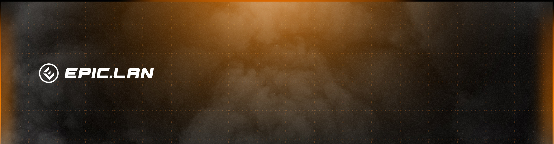
Although they were fond of their old logo, they realised it was becoming challenging to work with from a modern design aspect. Their design team had been working hard behind the scenes and had recently created a new graphics suite, so they wanted to bring their logo up to date while keeping some of the key design aspects, such as their epic ‘dot’ and white and orange bold colour sceheme.
The new epic.LAN logo allows for ease of use across their platforms; from social media, print, to broadcast. Its clean, bold and modern design allows it to be more impactful and flexible no matter where they’re using it, or whether they use the iconmark or wordmark on its own – it still packs a punch.
Check out the finished product below:
If you’re looking to update your existing logo or brand identity, or looking for branding experts to build your new brand, give our experts a shout!