Have you ever wondered how a creative marketing team goes from an idea to a fully packaged brand, complete with a logo, brand guidelines booklet, usable assets, brand messaging, and lore? Here we will deep dive into our design process when creating the branding for the VALORANT Regional Circuit: BEACON. In this case study, you will be able to get a detailed insight into the following areas:
- Title and Branding Ideation
- Design Inspiration and Ideation
- Motion and Static Graphic Direction
- Overall Look & Feel
We have also explored how we applied the branding strategy to our social media and community management execution during the tournament splits, which you can read more about here.
Introduction
At the start of 2022, we worked with Riot Games to design the branding for a grassroots VALORANT circuit based in the Northern Europe territories from the ground up. We needed to create a brand that would resonate with players and fans from the UK, Ireland, Norway, Sweden, Denmark, Finland, and Iceland. The task was to deliver the brand vision and positioning strategy, lore, overall design and visual identity of the brand, a full suite of static and motion graphic packages, and a brand style guide for use by broadcast partners.
Title and Branding Ideation
We approached the branding project with the aim to design and deliver something that held commonalities in all Northern European territories. We were extremely conscious that branding choices that may have resonated with our team in the UK, may not have held relevance to other territories and therefore developing a design language that could connect with as many people as possible was a core design philosophy for us.
The inspiration for the brand name came from our Founder, Heather Dower, who thought of the title “BEACON” whilst on a skiing trip. She thought of each “chairlift” entry point as a ‘beacon’ on the mountain, with the skiers using the ‘beacons’ to climb higher up the mountain face. This inspired the team to discuss the concept of ‘beacons’ and led them to the idea of beacons in lighthouses acting as waypoints across the ocean, connecting everyone across the region in a metaphorical and physical sense. This analogy applied aptly to the idea of the VALORANT Circuit, as it was designed to be tournament series that allowed aspiring professional players to make it to the next level of competition. It acted as a stepping stone, a place for players to travel safely on to their next step of the journey in the pro VALORANT scene. Our branding needed to reflect the nature of the tournament and amplify the players’ stories and performances so they could progress to the next stage of professional play.
Once we had the namesake locked in, we thought more about the practical applications of the brand and some goals we wanted to set before beginning the design process. We needed the brand and design to be future-proof, with design elements that could be easily adapted to keep up with current trends or shifts in consumer interests. We also wanted the brand design to be adaptable to partners, such as third-party tournament operators, so that they could easily integrate and use brand assets in their own way whilst maintaining adherence to brand usage guidelines. The brand also needed to be evergreen and not tied to specific seasons, so that the design would be appropriate for tournaments all year round.
Our brand guidelines booklet for BEACON can be found below:
Brand Guidelines Booklet for BEACON – Click the arrows to expand
The brand guidelines booklet allowed the BEACON license holders, Promod Esports, to ensure that their broadcast partners (such as Team Liquid, Dreamhack, and epic.LAN) were able to adapt and use the BEACON branding for their own tournaments correctly.
To accompany the brand we also designed a tagline, which would be used on all social media posts pertaining to the tournament operations. We had initially gravitated towards #FindYourWay, however, following feedback from Riot and internal discussions, we landed on #MakeWaves. This tied nicely into the nautical thematic present in the design and also tied into the brand strategy for BEACON, looking to amplify players’ stories and allow them to ‘Make Waves’ in the professional VALORANT scene.
Design Inspiration and Ideation
The name ‘BEACON’ also helped generate creative direction for the brand, as mentioned before we wanted the theme to tie all Northern European territories together, whilst also staying true to the purpose of the tournament series. We were immediately drawn to the idea of a ‘Lighthouse’, with its torch acting as a BEACON for adventurers at sea. We liked this idea as lighthouses are symbols of hope and safe passage (much like BEACON acts as safe passage to higher tiers of professional VALORANT play) but were also structures that were immediately recognisable and present throughout the Northern European countries.


Some examples of our early logo ideation and visual mood boards
We initially used the lighthouse as a literal template for our early branding concepts. We favoured bold, vector-based iconography that visually showcased a ‘beacon’ in the design. We drew from multiple sources of inspiration including Virgil Abloh, street art, nautical landscapes, kaleidoscopes, and north sea shipping lane boats. The kaleidoscope-inspired patterns also played on the idea of a ‘spotlight’, with the patterns of light signifying the many visions and stories of the grassroots teams building a name for themselves in the BEACON circuit. This resulted in two initial branding ideas that we put forward to Riot for review.
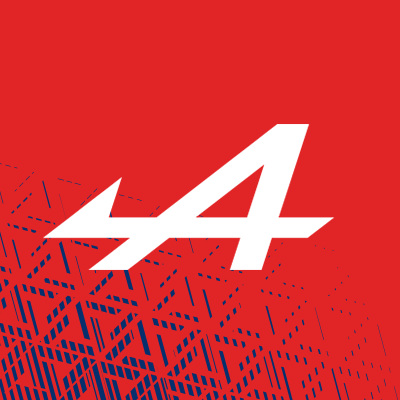
Version 1 drew directly from the ‘heart’ of the lighthouse and the Fresnel Lens that served as a guide for navigational aid. The patterns and geometry of the design were inspired by symmetrical light patterns and kaleidoscopes, whilst the borders and boldness tied the design to existing VALORANT ecosystems. The symmetry and flow of the design easily lent this option to be used for unique and bold static and motion graphical assets.
The colour scheme was interestingly inspired by a menu that Heather had seen whilst skiing and sparked our creative designers to look towards colours present on the North Sea Coastlines. Deep blues from the sea, greys and pastels from the rocky coasts, and oranges from coastal structures.
BEACON Concept Version 2 – Lookbook – Click the arrows to expand
Version 2 was a more literal take on the beacon in a lighthouse, expanding on our initial slogan ‘Find Your Way’ (before we reworked this to #MakeWaves). Again, the patterns and geometry of the design were symmetrical and played into the kaleidoscope branding ideas we had during ideation. The themes and the iconography used were darker and more gritty than version 1, pulling from ripped nautical charts and weather-beaten ships.
The colours were more heavily influenced by the range of colours that you would expect to see across the ocean. The ranges of greens and blues were designed to represent the deep expanse of the North Sea and bounced off the brighter colours of the logo itself, enhancing the ‘beacon’ feel of the logo branding, whilst also metaphorically representing the deep pool of aspiring VALORANT talent present in the region.
BEACON Concept Version 2 – Lookbook – Click the arrows to expand
Following feedback from Riot, we began to develop and build out ‘Version 1’ and iterate on our initial designs. The lead creative designer on the concept, Erin Logan, worked with the rest of our design team to build out and complete the package ready for delivery to Riot. We loved the idea of the lighthouse torches and were inspired by patterns on the glass as well as the way in which the light interacted with those patterns and wanted to build on the initial logo thematics that had been inspired by this.
Our second iteration of the BEACON branding focused on reworking the logo to feel more impactful and bold, whilst still drawing on the same inspirations that we had initially used. We presented a second version of the branding complete with logo and sponsor mockups, as well as example graphical assets that could be used on broadcasts or social media.
Revised BEACON Concept including revised BEACON Logo – Lookbook – Click the arrows to expand
Once the design had been finalised, were asked to mock up several different colours scheme for consideration. These schemes were designed to give Riot further options, but also to showcase how the branding could be easily adapted for different colour palettes, should the need arise to change.
BEACON Alternative Colour Schemes – Lookbook – Click the arrows to expand
The original colours were chosen because they were earthy and grounded, had ties to iconography and symbols that were present throughout Northern Europe, and most importantly worked well when applied in practice to a variety of assets to be used across social media and broadcast.
“With ‘BEACON’ paving the way to inspire and grow professionals, creating a brand that solidified this was vital. We pulled inspiration directly from the heart of the lighthouse, specifically the fresnel lens that serves as a guide for navigational aid. This allowed us to create unique concept of bold and modern kaleidoscopic patterns that felt at home within the existing Valorant ecosystem whilst also being unique and discernible as ‘BEACON. Northern Europe is such an inherently inspiring environment, it was easy to pull inspiration from the coastlines and deep sea for our colour palettes and textures throughout the brand.”
Erin Logan – Creative Designer at Hotdrop
Motion and Static Graphic Direction
Once our concept had been approved, we began to build out the motion and static graphic assets that would be used across the BEACON product. These included broadcast assets such as standings tables and brackets, as well as social media assets that could be used for announcements and roundups.
When approaching the static graphical assets, we wanted to ensure clear and concise delivery of information whilst retaining the clean and approachable feel we designed in the branding concept. The colour scheme allowed for text and iconography to stand out on the grey backgrounds whilst using orange highlights to accentuate the most important pieces of information, catching the attention of the viewer’s eye. A consistent, kaleidoscope-inspired, graphical edging was designed using the word ‘BEACON’ which further played on the movement and patterns displayed by light through a lighthouse torch and further tied to our directions with the motion assets.
Example final assets from the completed BEACON Branding package.
Our motion assets were created to mimic the symmetrical movement of a kaleidoscope and were designed to emulate the movement of light. We created broadcast stingers and wipes that used the branding in the graphical edging to eloquently introduce scene changes on the broadcast. We wanted every part of the design to feel tied to a core theme of a ‘lighthouse beacon’ so that the visual journey viewers would embark on tied to the core idealogy of the BEACON tournament.
We also presented a wide range of logo and sponsor lockups for Riot to consider – so that a consistent presentation could be used across all potential broadcast partners. We created a complete lookbook for the client and allowed them to decide which formats worked best for BEACON overall.
BEACON Example Sponsor Lockups – Lookbook
Overall Look & Feel
The end result was a complete tournament branding package that had clear and direct inspiration from a core theme that tied together the Northern European Territories. Throughout the entire branding process, we were able to effectively showcase our vision for the brand and integrate client feedback into the design to create a truly unique and special product for a grassroots VALORANT circuit.
We wanted the brand to feel approachable but retain the premium quality and boldness expected from a Riot Games product. We also wanted to ensure that players and fans in the circuit ecosystem felt like Riot was treating them like the professional esports players they aspired to be. By giving these grassroots esports players a truly quality experience both on broadcast and social media, we hoped to elevate their own aspirations and motivation to chase their dreams in VALORANT esports. We believe that we succeeded here through high-quality motion and static graphical assets, a truly premium colour palette that had direct ties to themes within the region, and a logo built from scratch that was both simple and eye-catching.
Riot Games was extremely happy with the outcome of the design process and the finished product was a true testament to the skill and innovation that we’re so proud to possess in our team here at Hotdrop. The BEACON branding is now currently in use and has rolled into its second split of 2022 – we’re excited to see the evolution of the brand and know that thanks to the hard work put in by our team the design will continue to evolve along with the Northern European VALORANT ecosystem.
We hope you enjoyed reading about how we build a brand from the ground up, including the full creative design process from ideation to finished graphical assets. Working on BEACON was an absolute pleasure and our team had so much fun with the project. If you’re looking for an experienced creative marketing agency that is capable of a full brand build, please reach out to us via our contact page, or at hello@hotdrop.gg